Full Checkout flow

Express Checkout flows

Challenges & Strategies
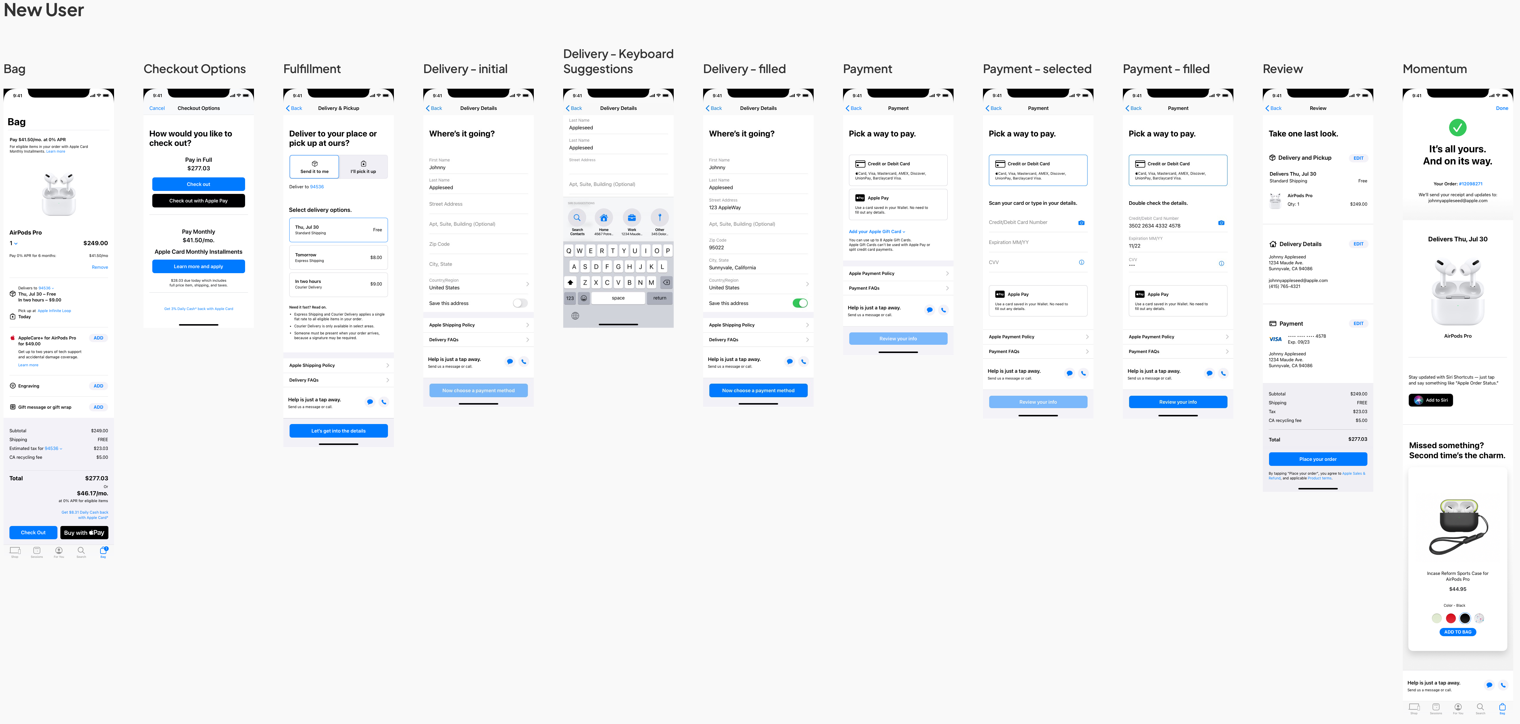
For the checkout experience on Apple Store App, the ask was to increase purchasing KPI. To achieve it, the key things to consider were the customer mindsets. What the customers needed the most was the confidence and assurance that support their decisions. Also in order to decrease the drop-out rate, the checkout flow needed to be easy, simple, and fast instead of overwhelming and frustrating.
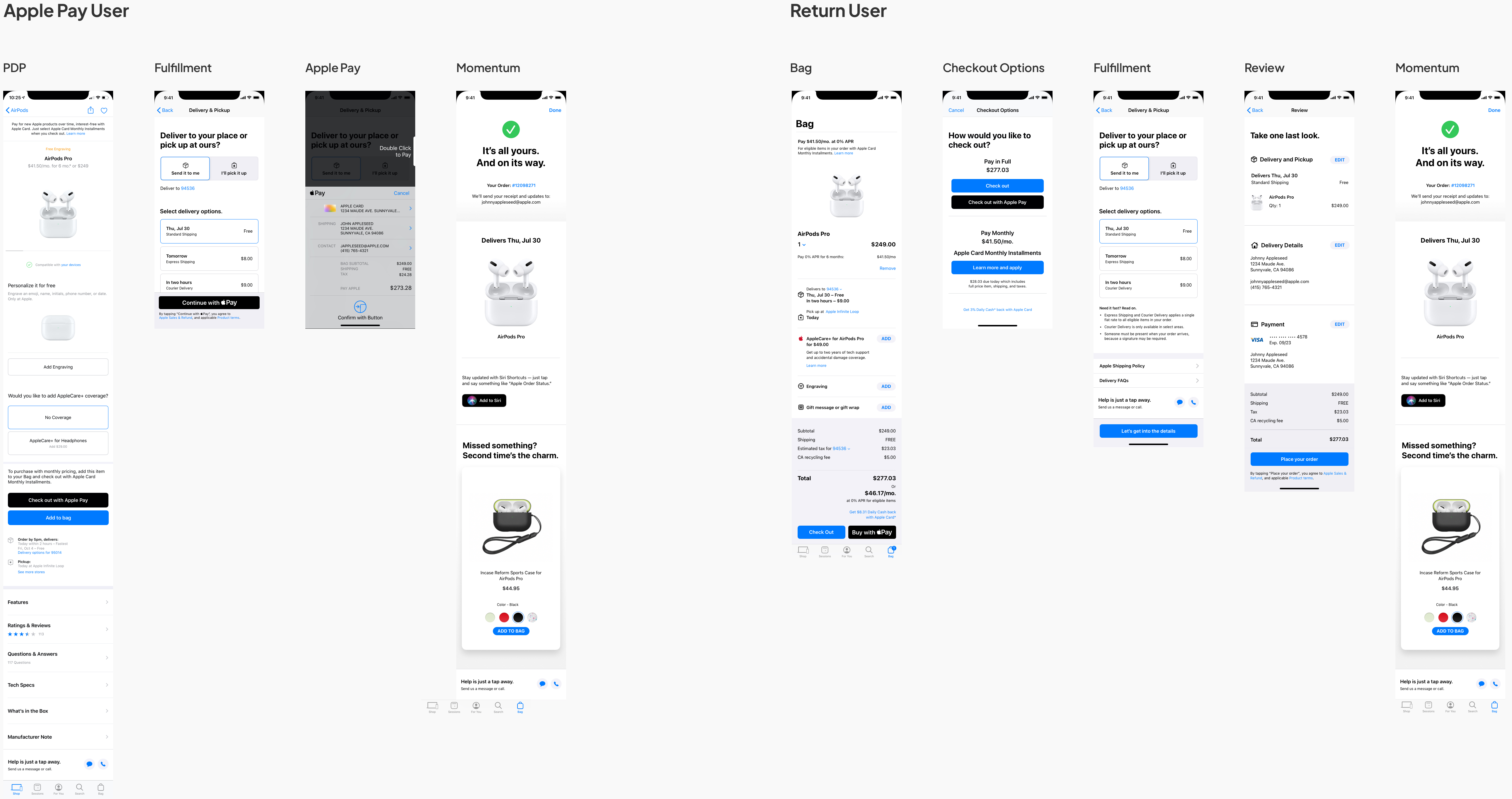
With the new design, the information is clear and easy to scan by using the right visual hierarchy, with minimal use of colors and visual elements. The total price is shown along the checkout process in the sticky area to give the user assurance and confidence. The use of native iOS elements and features not only make it feel part of Apple ecosystem but also easy for users to understand the visual language. The returning users can now checkout faster with the use of Siri and stored personal information. The toggle between delivery and shipping makes it easy to compare the two options. Each step has the right amount of information with enough white space to group or separate elements to make it digestible. Anything that can be editable is visually actionable, with enough contrast and better alignment.
Throughout the flow, the checkout experience is seamless and unobtrusive, followed by the confirmation page at the end with order details and the next steps, giving users a peace of mind. With the animation on the checkmark, it visually celebrates the moment and provides assurance on their purchases.
See more details